
The Cat In The Hat
Children's Book
 This Illustration uses Simple red and white block colour on the character 'The cat in the hat'. The artist in this book has used lots of rounded black lines on the character they has used these lines as shading I think this to give the character body a rounded shape but also looks like fur at the same time There is more detail in this image then some other line drawing examples the hat also has black lines I think this is to give the hat shape too also adding shading at the same time. The text is simple and easy to read this is because it's a children's book.
Vault boy
 This is the Vault boy Cartoon Character from Fallout 3.
This character uses block colour only there is not shading what so ever, I think this is so that you focus your attention to the Nuka Cola bottle.
The most detail is in the bottle as it has shading and light reflection detail to give the effect that the bottle is glass and there is still liquid in the bottle. Nuka Cola bottles is a very valuable object in the game I think this shows in the image due to the detail on it.

Iron Man
Comic Book
This image uses less block colour then some other examples, the artiest has used black lines to give the character shape and shading this image has a lot of detail because of this. The artist has also used A white line around the edge of the character I think this is to give the character a glowing effect. Its also uses yellow star shapes around the character to give it a twinkling effect, also adding to the glowing effect. The black shading on the chest gives definition to the abs.
Pepper Pig
TV Show
 This image uses only block colours, the block colours isn't bright like some of the other examples it uses almost pastel colours. On the characters the artist has added a small pine stripe line of colour that is brighter then the shade of pigs outfit. There is no shading or light reflection on this image. The artist has used a circle shape in a brighter shade of pink then the skin tone to give the pigs cheeks. The background colour has no gradient ether this could be so that the children keep they're attenuation on the characters as they don't have much detail and if put on top of a busy background will no longer be the focal point of image.
Foster's house of imaginary friends

Pablo Picasso
Picasso Takes ordinary everyday objects paints them in a abstract form.
Underneath is a good example of this, he has painted a candle, a jug and a souse pan.
These objects are normal quite round, picasso has changed these objects to interoperate triangle shapes.

Examples of Ordinary Objects in Art -
photo found -
http://oilpaintingdiscount.com/index.php?main_page=index&cPath=11_105
Andy Warhol
Warhol takes everyday objects or icons and changes the colour scheme 4 different times to make a collage of the item in a different colour form.
Warhol takes everyday objects or icons and changes the colour scheme 4 different times to make a collage of the item in a different colour form.

To recreate the style of Andy Warhol I created a new layer in Photoshop, with the paint brush tool I masked over the Dr Pepper lid and bottom, then changed the hue and saturation to an orange colour after doing this I changed the Layer type from normal to colour burn. I then coloured in the rest of the Can with the pen too to select the area I wanted to change the colour then used the fill tool fill the selected area with colour.


photo found -
http://tulsafood.com/talk/soup-at-the-movies/andy-warhol-pop-art-campbells 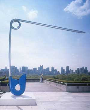
Claes Oldenburg
Corridor pin blue, 1999
Photo found -
Eduardo Paolozzi

To recreate the style of this artist I took a photo and placed it into Photoshop I changed the image to a sold black and white. I then changed the Hue and saturation of the image. Repeated the precess 4 times using different colours then put the images together.

Road Signs -
End of dual carriageway -
End of dual carriageway -

I thought I would changed this sign to fit the purpose of my games
This would be a good way to indicate the player there is to different paths they can take
Left or right
It would be up to the player to chose what path they would take
This would be a good way to indicate the player there is to different paths they can take
Left or right
It would be up to the player to chose what path they would take

Risks of rocks falling
I used this road sign in one of my game screens to show to players rocks where at risk of falling.


No comments:
Post a Comment